

Suzie
A friendlier path to trusted care.
Suzy's Critter Care needed a website that felt as personal as the service itself. The new homepage puts real photos, the service area, and the quote request in the first view, while the navigation makes pricing, testimonials, and contact details easy to find. The result is warmer, clearer, and much easier to act on.
Visit live site →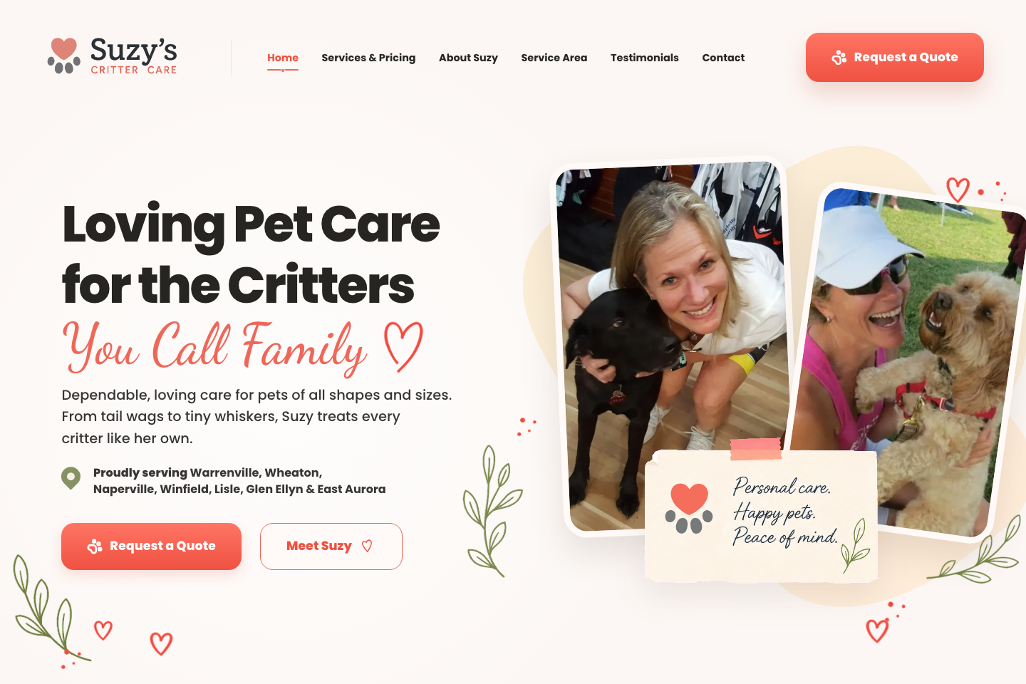
The business was already there. The website needed to catch up.
What needed work
The business depends on personal trust, but the previous presentation felt more like a standard website than a reflection of Suzy's hands-on care. The page hierarchy needed to surface the service, the person behind it, and the route to an inquiry without making a pet owner search through the site.
What we changed
The homepage now leads with Suzy's own voice, real pet-care photography, a clear service-area note, and a visible quote request. Navigation keeps services, pricing, testimonials, and contact within reach. The content is easier to scan, while the warmer visual system fits the personal character already present in the business.
Personal trust
Real photos and direct language put the person behind the service in view.
Service clarity
Care, coverage area, and pricing routes are visible without digging.
Easier inquiry
Quote requests stay prominent in the header and first screen.
Built around the trust pet care requires.
The homepage introduces Suzy, names the service area, and keeps the quote request visible beside the real photography.
A better website isn't decoration.
It should help someone understand the business, trust it, and know what to do next.
Clarity
Make the offer understandable.
Confidence
Make the business look as established as it actually is.
Action
Make contacting the business feel obvious.

Your business deserves the same attention.
If your business has outgrown the website representing it, let's build something that catches up.
Start a projectNext project → twoX