

VVSVisualz
The work needed more room.
VVSVisualz had strong material to show, but the website needed to let that work lead. The new homepage gives photography and video most of the frame, separates major service areas, and keeps reels close to the first visit. Visitors can quickly see the kind of work VVS makes and where to go next.
Visit live site →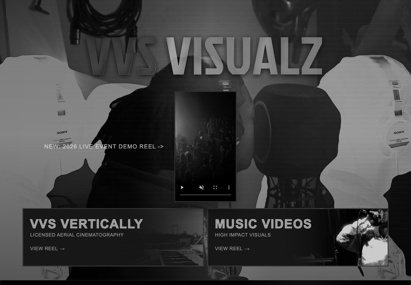
The business was already there. The website needed to catch up.
What needed work
A media company can't ask visitors to imagine the quality of its work. The previous presentation did not give the photography and video enough room to make the first impression, and several services competed within the same view. VVS needed a clearer way to show range without burying the work under explanation.
What we changed
The revised homepage treats the media as the explanation. Large imagery establishes the tone, a central reel gives moving work immediate priority, and separate sections make the main service areas easier to scan. The navigation stays spare so attention remains on the work and the next useful link.
Media first
Photography, video, and reels take priority over long descriptions.
Service separation
The main kinds of work are easier to distinguish at a glance.
Direct next steps
Reel and contact links sit close to the work they relate to.
The work gets most of the screen.
The homepage uses scale, contrast, and a spare structure to put finished media ahead of agency language.
A better website isn't decoration.
It should help someone understand the business, trust it, and know what to do next.
Clarity
Make the offer understandable.
Confidence
Make the business look as established as it actually is.
Action
Make contacting the business feel obvious.

Your business deserves the same attention.
If your business has outgrown the website representing it, let's build something that catches up.
Start a projectNext project → Trever Fuhrer